Ricardo Fumanal: Illustrations

Image

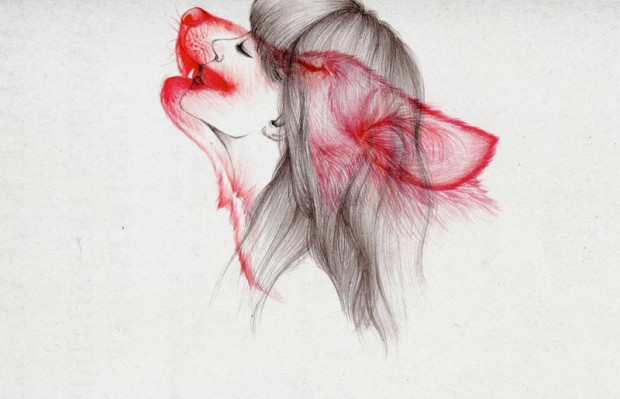
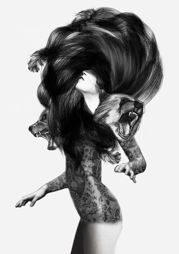
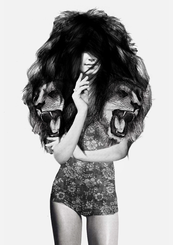
Spanish illustrator, Ricardo Fumanal has gained himself an impressive client list including Fred Perry, Revlon and Vogue as his work ranges between Fine Art and Fashion in his unique illustrative style. Fumanal’s professional areas delve within traditional drawing such as graphite, pens and ink to more media based work. I find his work completely mesmerizing as he refrains from allowing colour to interfere with his message/concepts. Fumanal intensifies his work with reality and clean cut drawings which I believe work well to communicate the message clearly with the audience refraining from misinterpretation to arise. I found Fumanals work extremely inspiring as it cleverly blends between reality and the illusions of fantasy that can be gained through illustration work. Fumanal’s work is often seen within advertisements and magazine editorial work, as I am working within this design area I found Fumanal’s work extremely interesting in order to understand how illustration can successfully communicate with the audience in this media area. Fumanal transforms images originally found on the internet into his own amazing designs, almost making them unrecognisable to the original. I do find his process interesting however I would personally be more appealed if he created the images from his own imagination rather than simply using one image and adding features to it, this is clearly a process that allows him to gain the realism within each of his pieces. A huge element of Fumanal’s work that proves successful is his talent to perfectly suit his drawings to the reason behind their creation. The message through his work of the product that the designer/client is advertising is clear in each illustration, this may be through colour, enhanced detail and/or medium. I prefer Fumanal’s back and white drawings to his colour designs as they add a large amount of seriousness and refrain from producing a cartoon style of approach. As my work has a serious tone to the issue that I am working with, this style of work inspired me greatly throughout experimenting with tones to use within my project. I believe that these tones communicate an extensive realistic message to the audience and the delicacy used within the illustrations clearly focusses on appealing to a more feminine audience. This could be a huge drawback if the client aims to appeal to a wider/mixed audience, like in my project I aim to communicate with a wide audience due to the seriousness and importance of the issue/concept.

In a lot of his work, Fumanal uses colour as a key element in order to highlight target areas of the scene such as advertising products and/or emphasising main words in a message. The contrasts of colour and black and white areas of the scenes depicted and created by Fumanal proves extremely appealing as the contrasts of colour attract the audiences attentions greatly and successfully gains their attention to then communicate with them. When looking at one of Fumanal’s pieces the purity of the white and bold, harsh black lining and shades work perfectly to attract the attentions of the audience. I find that the purity of the white creates an extremely simplistic/minimalistic scene, very successful for campaigns such as beauty, fashion and themes similar to this. This colour scheme would not work successfully with many projects however in a fashion illustrative style this design works very well. For my work for instance this design scheme may not work as it produces a clean cut, pretty, feminine approach to the issue.

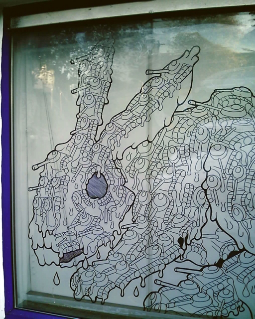
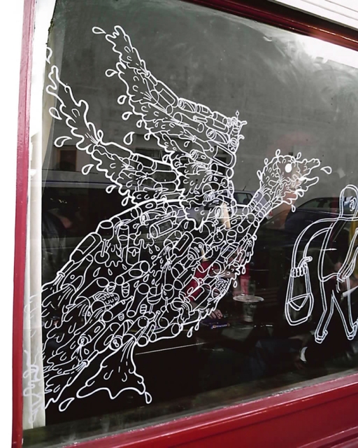
Using intense detail in his illustrations, Fumanal is able to create a very realistic scene in order to communicate the message of the issue clearly with the audience. I find the sever shading and darkened tones very sophisticated and serious, however they are used in a less harsh tone. Personally, I prefer to delve within darkened tones like Fumanal however I believe that if used within an issue as serious as mine it may not work as successfully as a simple photograph and the seriousness of the issue is a main element that would be more successfully communicated through a photograph than through an illustration. Lines are crucial within Fumanals work. Due to the style and techniques that this designer uses such as the traditional skills and process, lines are kept simple and bold so that the features of the image are clearly communicated with the audience allowing the message to be clear and successful.

Main elements of this work that I find highly appealing is the use of black and white tones and intense shading. Fumanal’s work produces a graphic style but through illustrations and the heightened depth created by tones work extremely well to gain the audiences attention. Looking at a lot of this designers work I find the human images a lot more successful than the animals! It is clear to understand how this designer produces very fashion based scenes and styles of illustrations and I find them more successful than his advertising work. Described as having a “confrontation between figures and background”, I find that the beautiful contrast between tones and the elements between the foreground and background works extremely well as he uses a range of resources such as tropical items, spontaneous icons and tangling elements to create unique designs and scenes.

It is clear that in a lot of Fumanal’s work he is aiming to communicate the realism of the image and scene to the audience through a very soft, simplistic and extremely realistic approach. Inspirations within an artists work can be crucial to their imagination and the success of the work. A lot of fashion based media have been inspiring to this designer ranging from photography to catwalks and casting and this can clearly be seen in a lot of his work! I find Fumanal’s work successful when communicating with his audience however I believe that in an advertising format simple type would be a lot more enhancing and successful when communicating to the audience, to sell the product. For instance a simple sentence, or the brands name, slogan. I believe that this work could be furthered a great deal and could be improved to work better in the advertising media, in order to simply produce a nice illustrations that viewers may admire I believe that this designer creates his work well. When advertising a product I believe that using photography works a lot more successfully and illustrations work better to produce an image that looks appealing to the audience.

ENPA Animal Testing Campaign

The image above is an advertising piece created by the ENPA Campaign in order to highlight the harsh reality of testing animals for beauty products. The use of photography in order to create these pieces allows a great deal of realism to be obtained in the scene. As the image shows the human using an innocent animal as an object, its hits home the reality behind the issue. I really like how the animal is objectified in this piece in order to highlight how these animals are being used for our luxury! This is a perfect way for the realisation of the subject to be highlighted! The background to the piece also works as a highlight to the female and animal within the foreground allowing the central attention of the audience to be kept on the main object and refrains from overpowering the image at the same time. The facial expression of the female within the piece clearly highlights the idea that humans enjoy using animals for their luxury, through objects such as beauty products, items that aren’t needed but wanted.

This piece includes informative type that is large enough to be seen and understood yet small enough to be understated and refrain from overpowering the image. Giving detail into the campaign and the company, the white typeface is clearly readable by the audience, clear against the darkened background and simplistic enough not to take the attention away from the main image. I like the choice of colour and placement in this piece in regards to the type as it suits the piece as a whole and works well for its purpose. As a viewer to this piece I find the choice of placement and layout working extremely well. The type and image together work as a team and are appealing to the audience.

Another element of this piece that I find highly appealing is the change of depth and tone of the background. The darker tone is used behind the lighter foreground and lightens toward the negative space of the scene making sure that the audience are not drawn to a blank colour but a change in tone. To me I find this more appealing than less attractive. Image

Despite understanding the conceptual message being highlighted here, I believe that the way the animal is portrayed, in the piece is slightly unnatural which in one sense would link to how they are used unnaturally for products however would refrain from the audience believing the piece and scene. Perhaps using a more natural stance of the animals would benefit the piece greatly. Another benefit to this piece would be to use the animals in their products, for instance if the animal was in a perfume bottle.

Communicating with the audience through a realistic view of the of the issue at hand, this piece for instance forces the reality of the testing of animals to the audience. Using a small innocent, cute animal would also appeal to the sympathetic side of the audience. Like how many advertising agencies use young children to appeal to the mothering side of the audience, the use of a baby animal works in a similar way, I find this technique highly appealing and extremely successful in order to gain an appeal from the audience. As an overall piece, this advertisement works perfectly in communicating the message to the audience. The chosen audience for this piece in particular would clearly be a more female based audience as the scene uses make up and luxury beauty items which would mainly be an appeal to females, and an older female range. If children were to view this piece they simply would not understand, perhaps this style of imagery could be used in a set and each would benefit from appealing to different people in each. For instance, one could appeal to a male audience, one for children and another for females. This would gain a wide audience range as well as pushing the issue to gain more audiences.

So what is this piece saying?

Clearly the piece in question is highlighting how young, innocent, defenceless animals are being tested for products used by humans. Using an animal in a way that would clearly be recognised by the audience clearly refraining from the wrong message being processed. As the model in the image has a very “beauty advertisement” view, it portrays the idea of animals being used for product testing greatly. The use of simplistic and minimalistic type also allows the audience to have an informative insight into the message behind the work which prevents the audience from misinterpreting the entire scene.

Is this successful in its aim?

As an audience to this piece I believe that it is successful to its purpose as it clearly highlights the message that it is portraying as well as being appealing in itself. I believe that this scene has been a success in design as well as suiting it’s purpose.

Onekind: “Advocates for Animals”

ImageOneKind is a UK based animal rights industry that has had a campaign created in order to highlight the similarities between humans and animals using celebrities in order to gain a heightened amount of audience attraction! I admire how this campaign uses celebrities as it is a good way to gain the attention of the audience. Society and media within our age has taken over causing celebrities to become role models and using them within the campaign would manipulate the audience into wanting to understand and view the images as they recognise those involved. A main element of the campaign that I find extremely appealing is the way that the celebrities and animals look alike. From the facial expressions to how their personalities would match. For instance the make up used within the image above causes the the celebrity model to look more like the animal, adding depth to the eyes and enhancing the colours. Another element of this feature that I find highly appealing is the use of bold colours to highlight the important aspects of the image. The faces of the celebrity and animal are heightened in colour manipulating the audiences attention to be focused on their similarities between them and refrain other  areas being a distraction. Using white type in order to inform the audience is another successful element that the designers have used. As the background has been kept excessively dark the type stands out without taking the audiences attention away from the images. Using another colour such as red of pink may have taken the attention of the audience away from the audience, proving that white has been a perfect choice. Also, white appeals to both male and female audiences, alongside the use of both male and female celebrities the choice of type colour adds to a wider audience appeal. The use of a main slogan on the piece which links brilliantly with the images used and the overall conceptual message is a way for the designers to inform the audience of the message that is being portrayed as well as preventing the the type from overpowering the whole piece. When viewing this piece I understand the message that is being portrayed across, that humans and animals are the same. Aiming to highlight how killing animals is like killing ourselves I believe that this piece works well in highlighting it’s purpose. However, criticising this piece slightly I believe that a more appropriate way to further the images used would be to use them at a larger scale as I believe that the amount of negative, dark background space can be slightly overpowering to the audience. master.merle1

Like in the image above and to the right, the faces of the celebrities link to the faces of the animals. Their appearances are aimed to match up. In the image using Johnny Vegas and a bear I find the facial expressions of the bear unappealing, as if the designers have adjusted the expression to suit the human, this is to me seems wrong as it goes against the concept, they have changed the face to suit the purpose, a meaning totally against the initial aim of the piece being created.

Besides this, I love how the celebrities signatures are also used in the piece as it adds a personal touch to the work, This would appeal to me if I were the audience. Clearly, the audience appeal is aimed at a more older audience as the celebrities used would generally not appeal to younger children. However, a range of celebrity faces have been used to appeal to different audience types. Researching into this advertising set, I have found three to four styles of designs within this campaign, I believe that this may reduce the audience range as more celebrities used may widen the audience.

Gaining a large range of feedback and support one of the creators announced that  “A lot of people have gone the extra mile to make this campaign happen – from the client, right through to the agents and the celebrities involved.  Our recent work for the Seals campaign attracted record numbers of new supporters, and we are hoping that this activity will create widespread interest in all of the work that Advocates for Animals does.” proving that the campaign has proved a success. Personally I like the campaign and find that it works well with the message that is being portrayed. The simplistic and repetitive layout allows the separate images to work as a set all linking in design however each appealing to a separate audience range and highlighting the same conceptual message.


Collin Bogle: Wildlife Paintings

Image

Creating excessively realistic, and beautiful animal wildlife paintings, Collin Bogle has “remarkable ability to capture detail and to master the use of light in natural settings became hallmarks of his work”. He uses delicate, traditional techniques to create his work. Allowing his work to take lives of their own through the extensive use of light and shadows this artist is able to work in a unique playground in each scene. Focusing mainly within pastels, watercolours and paints/pencils the traditional materials and media used perfectly suit the style of work created by Bogle. Fascinated by the beauty of nature, animals have continually been an inspiration for his style of work, perfectly linking to my project. Striving to “create magical moments in nature where attributes such as composition, lighting, color and animal expression come together in perfect harmony” Collin Bogle manages to successfully do this throughout a range of his iconic, brilliantly painted pieces. Perfectly choosing a range of elements such as shading, lighting, format, colour and positioning Bogle defines these features of his work in order to communicate his concept to his audience. Clearly the audience than he focuses his work to appeal to is an older more sophisticated audience range. This is obvious due to the style of painting that Bogle uses. Realistic painting is used in order to duplicate scenes that would be found in the habitats of the animals that are being illustrated within. This is done so that the artist can create his idealisation of what the animals live like. Using a more cartoon style would appeal to a younger audience but realistic painting has been used as the Imagetarget audience is of an older range. The eyes of the paintings are always made a focus point of the paintings and the use of enhanced colours attract the audiences attention manipulating them to want to view the piece of work. I really like this unique feature used. It would mainly be used through photography and is a common edit style to use. I find this elemental feature perfect for this artists style of work as his scenes and animals almost become fantasy like. This is a unique way to illustrate wildlife animals through art. Communicating the beauty of these animals with his audience the enhanced colour and focus eye point works perfectly. The same style of facial expression is used in all paintings created by this artist. I like how his work is constantly relating to one another however I d believe that he would be able to gain a wider audience range and a larger style of portfolio is he allowed his animals to take new forms. 

Successfully communicating the beauty of the animals with the audience through the enhanced colour used, I believe that it may cause the audiences attention to be used sparingly and refrain them from focusing on a central area. In order to use this style of work through a more graphic advertising style of work it would be more useful to use photography and edit. It would certainly be a faster approach as painting the scenes is undoubtedly a more time consuming technique. Aiming to convey a story or meaning behind his work, this artist prefers to add a new sense to his work rather than a simple, common animal in it’s habitat. Admitting that he uses Photoshop to enhance his work to finalize the results, I find this almost stops his work from being traditional and almost ruins the originality of his style of portfolio. His work simply shows good crafted paintings being seen by the viewer in relation to using these for other purposes photography would be more suitable and appropriate mediums to use.

As a viewer to this work I find the eyes are the focal point, personally they are the areas that really appeal to me and make me want to understand the animal. This style of approach would suit my project perfectly. The would be good to use in an anti-hunting campaign as the eyes allow the audience to look deeper into the personality of the animal, highlighting that they aren’t just object they live like us. I aim to delve within this and research this style of work. 

Tim Jeffs: Animal Illustrations

Illustrating with deep complex and extensive amounts of detail, Tim Jeffs uses composition in Imageorder to formulate the intricate subjects and objects that he draws from. Using animals within his work he keeps his style very minimalistic. Creating “amazingly detailed animal portraits” Jeff’s uses thick, rich, black ink to back his delicate illustrations. This effect and technique I find highly appealing as it allows the audience to communicate solely with the drawings central to each creation. The thickness of the black refrains from overpowering the image as it is simply their to highlight the central portrait. The skill and delicacy used when creating these magnificent drawings almost manipulate the audience into believing that they are in fact photographs taken and edited. Extremely hyper-realistic in style, Jeff’s simply highlights the beauty of the animals that he is drawing from. Choosing to use pens to create his work, the materials are able to capture the delicate features of the animal that many would not see in other illustrations. As a viewer to this work, I find this style extremely effective. Clearly communicating Imagewith an older audience as this hyper-realistic style would not appeal to a young audience, Jeff’s simply created his work to then be sold to whoever would like to purchase them. An element within this illustrators portfolio that I love is that they are drawn from a side view. This adds depth and interest to the work as the audience immediately see the animals in a different format, contrasting from usually seen from portrait state. “Intricately detailed” Tim Jeff’s portfolio includes and “impressive amount of animals” perfectly suiting my style of project. However, it is obvious that this style of drawing would take an extensive amount of time to produce and complete Imagemaking the audience wonder why he would not simply use a photograph and edit it. I find this style of work highly appealing simply for appreciating the skill and technique used. The intense detail used would immediately appeal to the audience and communicate the beauty of the animals. I find the tones used add a sophistication to the animals and the scene being used. The grey tones and shadows used highlight the features used of the animal as well as illustrating them in a sort of business style. These colour tones would usually be represented with sophisticated business men or dull scenes, darkened contexts. I find that the way they have been used here perfectly suits the format that the animal is being drawn in. I love how the animals have been illustrated however I do believe that a simple message or sentence of type could transform these illustrations so that they could be used in an advertising aspect.

The only criticism I have with these illustrations are the time they would use to be created and that many may find them boring because  they are simply recreations of animals, they do not contain vibrant colours, interesting types or materials, they are simply drawings and due to the increasing conceptual style of art being created through digital media and graphic design, many would see this as a dying style of illustration. I however find it inspiring and fascinating to understand that a person has drawn with such skill. I aim to delve within this style to experiment thorough drawing for my project. 

Peony Yip: Animal Illustrations

Captivating a great amount of simplicity within her work, Hong Kong illustrator Peony Yip createsImage illustration that express similarities between humans and animal using distinctive contrasting materials. From the images found it is clear to see how the models and animals have been specifically chosen and drawn in specific motions and facial expressions. For instance in order to communicate a large resemblance between the two to her audience, Yip has ensured that in this example both animal and human have their mouths wide open, highlighting an obvious link. An element that I find very appealing and effective is the contrast in colour tone. The vibrancy of the red against the grey, soft tones of the human drawing can be interpreted to show how vibrant/wild the lifestyle of the animal is to the less action filled, residential, boring life of the human. Red is often used to represent anger, love, lust and danger and it is no surprise that the lifestyle of the animal links to this representation of colour. Similar to the human colour tone, grey’s can be linked to sophistication, building habitats and materials often used in large cities, this would perfectly represent the lifestyle of many humans. I find the huge contrast in colour and media used perfectly situated to the relationship and message that this illustration is portraying to the audience. As a viewer of this work I find it highly appealing and interesting techniques to use. Drawing her inspiration from animals and nature it is clearly seen through her drawings. Aiming to keep her work simple and minimalistic, this illustrator refrains from including background in her work as this allows the illustrators creations to attract the audiences attention to only be focused on the elements she wants them to be. Keeping he work simplistic she is able to ensure that her audience are only focused on what she is illustrating and as colour is a huge element in her work it is important that there are no other features manipulating her audience away from the drawings. Believing that “animals symbolizes the humanity that the world lacks” Yip uses this as her inspiration, her purpose is to illustrate how as similar as these animals are too humans they Imageare also more humane than. A different style of concept than many illustrators usually use. Using mainly traditional techniques within her work, this illustrator focuses mainly within materials such as watercolours, pencils, graphite and prefers to steer away from digital work. When looking at this work, I really like how the red overlay does not overpower the underlying human illustration. It works with it  as if the two are the same in a way. This is a very interesting approach to use when communicating to their audience. This style of work can appeal to a range of audiences, the simplicity would allow children to find it attractive as well as  an older range. Strangely, I really like how the illustrator has kept her work very minimal. Refraining from adding type or other artistic elements it allows her audience to interpret the drawings in their own way, a very appealing and common approach. Using realistic styles of illustration work excessively well and have been used appropriately in order to fulfil the purpose of the concept as well as communicating the best with their audience. As the illustrator is aiming to highlight the similarities between animals and humans, real life mammals using realistic illustrations are appropriately used. I find this work very appealing and the techniques cleverly thought of. The use of distinctive colour has been key when  communicating with the audience. 

Criticizing this illustrators work and approach, the only areas that I find less appealing or successful than others are how the humans within the drawings do look slightly off balance. some of their facial features are less realistic and more  imaginative, idealistic to what the illustrator wants them to look like. Perhaps photography would be a good style to use but in this way. Overlapping simplistic images of animals and humans and editing them so that they use similar ideas and techniques yet more realistically approach the concept. I really like this style of work and plan on experimenting with this throughout my project and ideas. Being known as “unique and inspiring” this illustrator has been known for creating illustrations that are “full of emotion and detail.” I would not go as far as saying that these illustrations were amazing but they are unique in their design concept and idea creation. I believe that the concept and messages through the work are brilliantly created but the craft of the illustrations and drawing could be improved. Looking at other illustrations created by this artist they are all similar in technique and style, I do find her work lovely and find that it is more feminine and would appeal to a more feminine based audience. 


Luco Ionescu: Work for Skullcandy

Luca Ionescu WorkA designer who runs ‘Like Minded Studio’ Luca Ionescu whose clientèle includes famous branding companies such as MTV, Nike, Absolut Vodka and Reebok has been best known for his unique logo work alongside his ongoing inspirational typography skill. First coming across Ionescu’s work I found the unique style of colours and contrast of background tones highly appealing and instantly wanted to see more. This designer has cleverly transformed the skull used within this illustration from being perceived as simply a skull to being viewed as a unique piece/work of art. Clearly the skull has been used to represent the brand “Skull Candy”, linking the object being used to the initial name of the brand, the audience would automatically be able to link the two. I find the clear links brilliantly thought of. Being known to “bless” advertisements and brands with his unique type and graphic style of working, this designer has undoubtedly stepped up the mark with this set. I find the contrast of colours and the unique colour tones used within highly appealing. In reference to my work I believe that using a lions face would be very successful is this style of work would be used. I aim to research deeply into this designers style of work and understand the techniques and skill used when producing these magnificent pieces. I believe that the string lines and contrasts of colours used within work extremely well. Strength and power is able to be seen throughout this set of work as the the eye line of the skull and the position it has been placed makes the audience believe that the skull is looking up at something, gazing at something, mysterious. Producing work that would be linked to a “rock star” using a very harsh set of tones and lines, I love this style of work as it manipulates the audience into believing that the piece is stronger than them, the piece overpowers the S6HSDY122HP-2-Sideaudience. As the illustrations portray a great amount of strength the audience will feel strength. Luca Ionescu’s work has been admired by many and his styles has certainly attracted a huge audience range. His work has a unique style and I find his graphic, more harsh rock style of design highly appealing!

I love how he contrasts the black background with the enhanced foreground. This allows his foreground to be highlighted and central to his audience attention. He refrains from allowing any other elements from taking the attraction away from his initial design, I find this style greatly appealing as he blends minimalistic simplicity of colour with detailed and overwhelming triumph through illustrations. My favourite part of this set of work for music brand Skullcandy has to be the unique materials that seem to have been used. I have rarely seen many illustrators or designers used this style of working as many would name this material as being tacky, however Luca Ionescu makes it a success. Reviewed as being “epically cool” perfectly describes Ionescu’s work. He produces a style of design which would appeal to a young adult audience range, clearly refraining from appealing to children through the darkened approach he has, this designers work is aimed at the more adult base, teenagers and not for the “pretty little butterfly” style of people.

I aim to look further into this style of work and experiment with the styles of techniques that is used. Aiming to use his”own style within the advertising art and design world” in order to attract a wide audience from his unique style, Luca Ionescu always keeps an awareness of his brief whilst blending this with his style of process and creation. The “rock star” style has been used before however this designer has taken the previously used design and transformed it into his own.

All elements involved with the creation of this work has been distinctly chosen in order to produce the most appropriate piece in order to suit the brief given by the client. Personally when viewing this piece of work I prefer the large poster of the work rather than the design used on the headphones. I believe that this style of work does suit the product however would also suit being say a mural on a wall or as a poster, bill board or even canvassed. I love how this designer has given his work a dark yet powerful edge! Communicating a simple, nice and effective image with his audience he is appealing to the style of people who he knows would use this product. Hardcore music lovers. I would go out and buy this product as I find it simply looks cool. In order to suit the purpose of the brief which was to design an illustration that could be use don a head set I believe that this designer has suited and successfully completes his task!

Mart Klein & Miriam Migliazzi: “Economic Systems Elephants”

This artistic duo has produced endless amounts of work for clients around the world taking every concept and project that they are given and giving a fresh start in order to suit the style and project approach as best as possible. Giving each project it’s “Own Unique Look” I find the style of these illustrators very appealing as they often prefer to choose bright, outstanding colour tones in order to suit the needs of the project. This illustration that the collaborative pair have created for a magazine instantly screams colour and vibrancy to the audience. I believe that thisImage style of illustration would not appeal to all people. Personally I tend to stray away from brightly coloured, more graphic/cartoon illustrations as I find them less attractive than a simple photograph and this piece of work has not changed my mind. Viewing this piece of work I do like how the designers have incorporated the flags of the three countries into the scene in a unique way however I fail to understand why elephants have been used. Used as the cover, this would clearly manipulate the audiences eye into wanting to see what it is about as the colours are overwhelming. Providing an economic project issue with a new face almost, this style would definitely catch the audience attention and preferably appeal to them however I believe that in these style of issues a more sophisticated image should be used. 

Undeniably these illustration are well drawn, understandably identified to be elephants and the detail used within has been precise to the finest line, even the dripping of the paint has been added. I do admire the skill of the designers however the graphically cartoon, slightly less realistic style does not appeal to me personally. One area of this piece that I do not find complimentary too the scene is the darker shaded brown lines used through the floor of the scene. this elements takes away the natural habitat that the elephants would be seen within. Critical to the scene I believe that this simple feature changes the appeal to the audience as it takes away from the nature and forces the animals to be seen in a more comic style of light. 

Understandably the elements used within this piece would have been perfectly chosen by the designers in order to create the best approach and illustration in order to suit the project. Personally this piece primarily as an illustration does not appeal to me. Despite this I do find the use of the elephants and producing them as if they are painted very intriguing. I find this a good idea however believe that it would be better suited if real life elephants where painted and photographed as it would attract the audience and appeal to them more deeply and more successfully. In reference to the concept being portrayed I cannot simply understand this from the illustration. Without researching the piece and finding the concept this way, I believed that it simply showed the power of different countries and illustrated that the way they were all placed in the piece with China first they were initiating that this would be the more successful, stronger or better established country. Another interpretation that I found from viewing this piece was that these countries where teaming up. However all of these were incorrect. In fact the elephant representing Germany was intended to represent Europe, this personally seems a very risky way to represent a continent which includes more than Germany, I believe that this would be a huge disadvantage to the success and appeal of the piece toward its audience. The initial piece in comparison to the concept, personally does not quit fit. 

Overall I believe that this piece would appeal to it’s audience however I personally do not find it attractive. The colours used are appropriately selected in order to allow the audience to understand the scene and the concept that it is portraying however the elements such as the animals, scene and reference does not quite work as successfully. 

Andy Council: Window Drawings

Exhibiting a lot of his work through museums and galleries, Andy Council has transformed into an internationally recognised artist and illustrator. Whilst viewing his work I found his simple yet different styles of design impressive. Council’s window drawings allow clear lines and simplistic objects be transformed into an overpowering, overall image almost always linking ironically to the original object being used. For instance his “Tank Bunny” simply illustrates exactly what is being described in the title. Council has created an oversized bunny which almost looks as if it is melting and clearly produced only from small, almost elegant tank outlines. Using a differentiating media to other illustrators for this overwhelming piece, I believe that Council is aiming to highlight how this concept and issue is being looked through, like a window and no action has been used to address it. Using tanks to create the oversized bunny, I interpret this Imagepiece of work as being a way for Council to illustrate the realisation that when tanks are forcing themselves through endless fields they are destroying the homes of the bunnies. I simply enjoy looking at this piece as it is simple yet effective. In order to communicate this issue with his audience, I understand that Council has used a more ironic, humorous approach rather than showing the depth and realization through photography and still life. This way he is able to appeal to a wider audience range and be able to promote his work in a wider range of places as it is less gruesome and harsh to the audience. By using a different approach of media through the use of windows, I believe that Council is able to gain a wider attraction from his audience as they would be interested in his work through not seeing a lot of artists work like this. Communicating with his audience simplistically using this style of design, Council who is inspired by his surroundings, “often looking to the natural world” when finding inspiration for his work has clearly done exactly this when creating his “Tank Bunny”. Giving the everyday and “twisting it into something fantastic” this piece is a highlight of the style and way that Council works within. He has taken an everyday bunny that would appeal to a huge audience range and given it a new lease of life, linking it to the total opposite object that it would not usually be linked with, a tank! I like how Council has combined the delicacy and softness of the stereotypical bunny with the strengthened, mechanical design of the tank, he has undeniably bonded the two to emphasise the extreme difference between them. Usually I would hate this style of working, the cartoon style of drawing however because Andy Council has used primarily windows and pens it somehow works and appeals to me greatly! Producing unique contrasts of nature and mechanics as a young child this style has continued to grow with Council as he has Imageevolved into a well known and respected artist and illustrator. Similar to that of the “Tank Bunny” Council also created an ironically appealing “Drink Duck” which in a similar fashion to previous work simply highlights an overpowering duck created primarily from the outlines of bottles. An issue linking to the waste being deposited within ponds and the ocean, killing the natural habitats of these animals. I find his style of illustrating and referring back to an economical issue greatly appealing. Council is able to appeal and communicate with his widened audience as he uses ironically simplistic, clean styles of creation when discussing a more detailed, dirty issues.

Clearly appealing to his audience through a concept that more older viewers would appreciate, Council is able to attract both young and more older viewers as his concept has been communicated with a more child based style of design. I find his playful approach perfectly situated to the way the animals are being portrayed within. I specifically like the white duck on the window as I believe it calls out to the audience and stands out against the base material more than the black ink bunny. 

Council’s style of work can be viewed simply as a humorous piece and scene or as a conceptual piece of work. He almost produces his designs with dual meanings a concept I find highly appealing and extremely clever when wanting a wider audience to see and appreciate your work. The audience can interpret their own idea of what the work is about of they can simply look as it and admire. I find his work highly appealing and the simplicity within the choice of media, scene and concept all relate to one another. 

White usually always represents cleanliness and purity, using this colour in order to represent the issue of waste being deposited into lakes and streams, the homes of ducks, it adds to the irony of the whole piece. Usually this style of theme would be linked to green, murky colours or colours that would represent waste and earth however Council moves away from this and I believe that through communicating to the audience it has worked more successfully than those created from green and blue tones. 

Overall I find these pieces and designs highly appealing and I believe that Council has been able to attract a great audience range through his overall approach style and appeal. 

Jenny Liz Rome: “Ladies on the Flies”

ImageInspired by “wildlife, dream like colours, modern women, classic style and the female form, to create surreal and dynamic fashion images” Jenny Liz Rome’s illustrations take realism to new heights as she draws in an “abstract vision style”. Fusing her own style of photography with found images and blending these with illustrative media, this designer creates “fashionable” pieces of work as her style undeniably has an essence of beauty and passion within. Her characters “linger with a brazen sensuality”. I love how these styles of work produce a very sophisticated yet sensual style. The chosen colours used allow her work so communicate a great amount of passion across to the audience. I find the colour tones used perfectly defined and chosen as they suit the style and reasoning behind the pieces being created. Often producing work for clients such as Marie Clare and Black Monroe it is easy to understand the style and type of clientèle that Rome appeals to. Due to these styles of clients it is obvious to understand the audience that this designer works to attract. I believe that this work is greatly feminine and it is obvious that her work would appeal to a more female based audience. Also, it is clear that the audience this work communicates with is a more adult range as the images and illustrations created are more Imagemature than illustrations created for children. Alongside this he colours used a less child friendly and more adult appealing. The movements within the pieces are greatly appealing and they add a sensual mood to the piece. I find the figure within the pieces blended with the faces of wild animals an impressive and interesting technique to use. I like how the designer is portraying the females within the pieces as strong and determined as the wild animals that she is blending within. Collaging the faces and bodies of the females by using photographs the artist manipulates the audience into making them believe that they are in fact drawings. I cannot lie that at first glance I though that these were in fact simple pencil illustrations however I do like how the artist cleverly and perfectly collages all of the elements of the pieces together. Allowing herself to have the freedom to create a whole new person within her work, like a character of the piece, this designer prefers to focus on the female form, “the perfect canvas” for her to experiment with. Allowing the hair within the female sin her work to take centre stage to her Imagecanvas, Rome admits that she “finds it much easier to draw a ridiculous mane on a dancing woman” and I find it brilliantly beautiful within her work, it makes her work her own. When viewing her work I automatically look as the outfits being worn and the animals within them. This style of work is perfect in order to advertise the garments within. Using black and white tones it adds a great amount of sensuality and sexuality to her work. Expressing women in this way is also a way for this designer to show the female g=figure in a strong, overpowering way, similar to the animals within each design. “I have always been very interested in a humans potential to be a very primal creature”, Rome admits to being fascinated by the way humans and animals can be seen as similar and I find this extremely appealing as it links to the style of project I am working with in my final project. Using a multi layer process, Jenny Liz Rome uses photo shop in order to add all of her elements and create one image. I find her process interesting and perfectly suiting to her concept and style.

communicating the strength of the female figure and women through her work, I find Jenny Liz Rome’s work inspiring and appealing, probably because I am a female. When looking at he work the audience can see a beautiful figure that has been created and automatically want to be like them , we envy the beauty of the figure and are inspired by the power and strength that the female is created with. I love how the females illustrate immense amounts of power and believe that this is a brilliant way for the female figure to be displayed. The choice of colour, figure and clothing displayed within each pieces blends perfectly together and works as a whole in order to communicate with the audience.