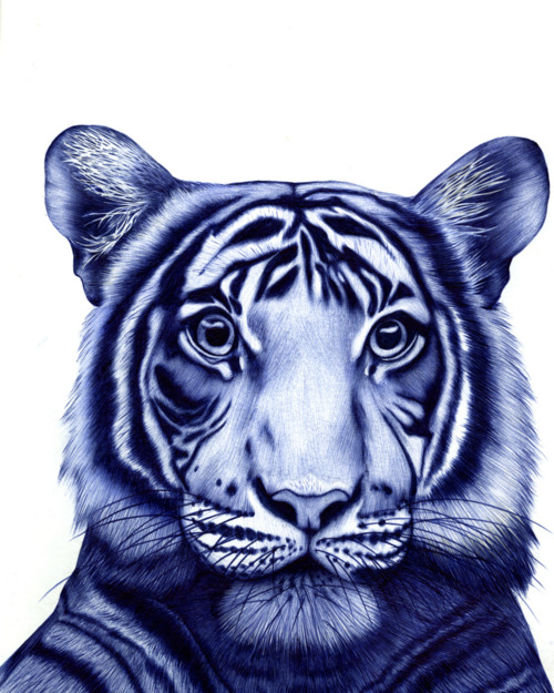
Graphic design based artist, Amy Hamilton, uses a layering technique in order to transform stereotypical animal portraits into unique, highly attention capturing pieces. This designer “thrives” when given a creative challenge and personally I adore her animal illustrations every time I see them. Creating “visual designs for digital and print media which include illustrations, typography, layout, branding, and photography” Amy Hamilton blends a vary of traditional materials and techniques such as graphite, gouache, ink, and watercolour with Photoshop, InDesign, Dreamweaver and Illustrator. Her hybrid approach to illustration is based through a fun design approach combined with realistic, stereotypical objects and animals.
This designer uses a contrast of colour between foreground and background in order to ensure that her illustrations are not overpowered or interfered by other, unwanted elements. Hamilton uses a pure, crisp white background, kept understated behind her intense colour palate within her drawings in order to keep the audiences main attention and focus on her crafted work. I find that the high contrast in colour is a way for the designer to manipulate her audiences attention to be kept in the image that she is communicating. The unique and un-stereotypical colour palate used for these realistic drawings produces a fun, magical approach to bland and more simple animals. This designer aims to produce an illustration of a simple animal in a realistic style, using unique colours to allow her audience to interpret them in their own light. I believe that when viewing this work Amy Hamilton aims for her audience to see the animals in a more fun, fantasy style of approach to give the animals a new personality. The understated white background also allows the animal to gain the full attention of the audience. Refraining from using type of other elements within this work the drawings can be interpreted by the audience without the input of the audience, this would allow the designer to appeal to a wider audience as she does not use specific colours such as feminine or masculine tones to be appealing. When viewing these illustrations I find their chosen audience is clearly of an older audience. The realistic approach in style would not be as highly appreciated by children or teens whereas an older audience would appreciate the talent and skill that design has. I love realism within work and the approach that this artist uses through fantasy designs appeals to me greatly!

Amy Hamilton uses a layering technique in order to gain her unique and effective colour scheme. Keeping many of the traditional colours of the animal relevant so that the audience can communicate what animal it is as well as blending unusual tones into the scene, Hamilton creates a new personality to the animal. She takes the original animal and allows her audience to see it in a new design.
I believe that the illustrations created by this designer produce a very soft, almost feminine approach which transforms usually aggressive animals such as bears and wolves into more appealing and friendly approaches. The expressions that these animals have are almost blank, allowing the audience to interpret them, making each design and animal illustration more personal to each person within the audience. “Very inspired by nature, she enjoys depicting colourful animals” almost giving them a colour autopsy. Her unique use of contrasting and appealing colours can also produce a new reality to the animal. Hamilton uses colours that appreciate the animals nature. Hamilton uses a very rough approach to her brush strokes, refraining from creating a very clean cut design. I adore this element of this designers work, the rough, rigid lines prevent the animal from communicating a finished look to the audience as this would almost enforce the realisation that this is the animal and would prevent the audience from interpreting the animal in their own way.
Elements of the animals used within Hamilton’s illustrations are often enhanced, through medium. Such as the watercolour running of the Moose Antlers, the fur of the bear and so on. I believe that this is a way for Hamilton to highlight the power of the animals that she is communicating. Also elongating the scene (especially within the Moose illustration) the simple adjustment attracts the audiences attention.
The process used by this designer of layering colour allows her to gain a perfected tone and shading within the scene. Enhancing the realism within the animal and adding depth to the image taking it from a 2D scale to almost making the audience believe it is a 3D scene, Hamilton perfects the tones, blending and deepness within the message and the animal.
Overall I love this design style and believe that the designer could use this in a range of purposed. Simple type could be added for an advertising approach, to highlight a product, to simply be admired by the audience and such.