 Approached by Saks 5th Avenues senior vice president Terron Shaefer to redesign a holiday window for the company, Pentagon transformed the display to produce the idea of a divided world using snowflakes and bubbles, a common concept used by Saks to advertise their merchandise. The conceptual idea within the design includes “the subterranean world of the bubble makers and the imaginary world of the snow makers” contrasted together to be able to be transformed into a unique design. The design uses a narrative style which communicates with the audience, in this case shoppers of the store to connect them with the merchandise being advertised. I believe that by using a narrative Pentagram are able to communicate with the audience of the company in a unique way by producing a fairy tale style of narrative to not only physically stand out against other stores but to produce Saks as a unique, singularly appealing store to manipulate the audience into wanting to shop there. The narrative used within the display includes machines and mannequins to portray the tale. Obviously the mannequins are dressed in original Saks merchandise alongside being used to work the machinery within the scene. I find the whole concept of this work fascinating as they are using the merchandise that they want to advertise as an element within the structural movement of the display. Taken from a book named “Who
  Makes the Snow”, he display clearly creates a Christmas mood, perfect for the holiday season that the company are creating it for. Seen by viewers as “imaginative and mystical as it gives the impression of being a fairytale style fantasy” the display clearly depicts a positive emotion which is then forced upon the audience. The piece also includes an 8ft Yeti, linking to the mood of the piece and the concept. This element of the display can be accessed by the audience to have photographs taken with, this is a perfect way for Pentagon to ensure that Saks gains a wide customer base as they are communicating with their audience decoratively through the display and physically. Working directly with Saks, Pentagon produced this design as “eye candy” for the audience. This would force them to be drawn into the store, successfully working for the purpose of the piece. This design has to be one of my favorites form this company. Using the mannequins as advertisements and elements of the working display I believe is genius. The colours used appeal to me greatly as they not only link with the whole display, they appeal to the season they are created for, Christmas. Snowy white tones are used in large amounts, perfect to appeal to an audience during this christmas period. However, I do believe that because of the huge display being more of a theatrical performance it may draw the audiences attention away
  from the garments being used and force them to simply see this display as a performance and not an advertisement for the companies clothing. Overall it is clear that the piece is an overall success gaining endless admired reviews from a wide audience. Clearly numerous elements needed to be perfected by the designers when creating and designing this piece. Ranging from the mechanical decisions to how the piece will work and the colours used to attract the admired audience. As an audience member, I admire the display and find it interesting to see how Pentagon had transformed the story into this theatrical design. However, I do tend to watch the performance side of the piece rather than admire the clothing, yes, it drew me into the display and forced me to want to watch it however for the opposite reason to why it should.
Monthly Archives: December 2013
Paul Cadden: Realistic Pencil Drawings
 Graphite and Chalk are the main materials used in super realistic artist Paul Cadden’s work. At first these drawings immediately manipulate the audience into believing that they are in fact photographs because of the intense detail and heightened realism that Cadden forces within each piece. Cadden aims to “intensify the normal” as his work are taken from real life photographs, images and video still styled media, despite this he aims to create work which goes “beyond the photograph” and from the realism that he intensifies through each individual piece of his work it is clear to see how his skill and talent can almost duplicate what is in the photographs. Cadden intensifies the detail found in the photographs. When viewing Cadden’s work I immediately admire his
  talent and his skill to duplicate images using graphite and chalk, I prefer to use similar materials in my own work which is why Cadden’s drawings admire me. Cadden admits that he has “developed slowly” as an artist as he aims to create “emotional, social and cultural impacts” through his work. Reference materials are crucial for his work, he firstly manipulates his original photographs in photoshop and transfers these to his canvasses. Unusually he defers from working straight from his photographs and allows the work to “take on a life of it’s own”. I find this final development from his work very unusual because as a hyperrealist artist his aim should be to duplicate the image entirely however he chooses to do this in a different way. A preference to use Cartridge paper than canvas, Cadden varies from both of these material when creating work. Personally, I prefer cartridge paper when drawing yet admire his skill to gain similar effects when using canvasses. varying from 2 to 6 weeks in order to finish one of his magnificent hyperrealist pieces, which are then exhibited in galleries in London and Atlanta. Inspiring Cadden he names Tracey Emin, Francis Bacon and Austin Spare as his admired artists. Connecting with his audience by manipulating them into believing they are photograph’s though his unique talent, Cadden communicates his work with realism in order to attract his audience. One criticism I have with Cadden’s style of work, despite being a style I find overwhelming and I admire greatly is that it may struggle to be used for advertising purposes and photography has overruled. I work similar to this style in a lot of my work however find it hard to use this style in order to create work for purposes. Overall, I admire Cadden for his skill and talent through drawing, although I have found numerous artists who work in a similar way to him and have very similar talents and styles when using this media, I believe that using this style for work is not as unique as others. Being able to draw well is becoming less and less rare and traditional techniques seem to be dying out within the Art and Design industry.

Sean Freeman: NY Lottery Campaign
Exploring harmonies of both beautiful images and words Sean Freeman specializes within creative type and illustration in order to create his sensually and simplistic yet effective advertisements and editorial work. An East London based designer, Freeman produces award winning work which expresses powerful and dynamic emotions to his audience. Fusing elements together, Freeman explores storytelling and visu al imagery to produce ideas for his unique type. Freeman’s design for the New York Lottery expresses festive moods due to the materials used to produce the type. Using flowing font styles he is able to create a bold message without using harsh, sharp shapes. Seen as a sign that “brings joy” it undoubtably fulfills it’s purpose of creation and it’s concept. Communicating clearly with it’s audience the bright lights being used contrast against the black background to draw in the audience and force their attention to be completely on the design. I find the materials used are genius as they produce an outstanding design and link perfectly with the season that this design was created within and for, christmas! Having a “love for words” is a crucial element and clear personal trait expressed through Freeman’s work. His 3D typography work outshines in this piece greatly. Freeman has continually used a range of materials that link to the concept and context of the piece he is designing making each piece personal in it’s own way to its’ purpose. In this piece for instance it is obvious that Freeman has used christmas lights to create a festive design for a piece distributed and created for a Christmas campaign. Obviously all of the features of this piece such as the placement, materials, type style and colours have all been depicted and chosen carefully in order to create a specific mood, I believe that it is a perfected design which I really enjoy. The execution of the colours and flowing type distinctly express a Christmassy mood perfect for the style and purpose of the campaign, to draw the audience in. Displayed throughout Manhattan containing around 2,000 lights in each installation, Freeman’s New York Lottery design is clearly a one of a kind style like a lot of this persons work. This piece is not only one of my favorites because I love Christmas but because I find that the elements of the piece all work as a family. Strangely, I struggle to find an element of this piece that I refrain from liking apart from the reason behind the work, I struggle to enjoy the national lottery but Freeman’s design for the New York Lottery makes me want to go buy a ticket instantly! Communicating with his audience to manipulate them into wanting to go out a but a ticket I believe Freeman has succeeded effortlessly with this design. Obviously this style of work would not be as effective in summer or around another celebrated time of year but for the time is has been created for it suits if perfectly. Using a happy, festive style of mood Freeman instantly draws his audience in, playing on what he knows they enjoy and using stereotypical materials linked to this iconic time of year. The simplistic style of font and contrast in the foreground and background colours he communicates his work with his audience in a happy way.
Steinar Lund: Cake Illustrations
Specialising in realistic illustrations clearly seen in his food inspired collections such as these super realistic cupcakes, Steinar Lunds work explores specialisms such as editorial work, publishing pieces and packaging. Rendering within Photoshop and digital elements he applies this to his unique talent of airbrushing to create these designs digitally.  This set of work ranges from digital airbrushing to photo illustrative pieces of work. Admitting that this set has been one of his favourite yet the designer’s flair for realism and perfected detail shines throughout his work. I find the realism within these illustrations admirable. Enhancing the colour tones and adding an almost perfected image of the food the designer is making art from a simple thing available to his audience in many areas. He is making them want the cupcakes especially visible within the pink cupcake illustration his skill manages to make the icing look heavenly and by using one set of colour tones keeping real to the object but also emphasising them he keeps the images clean and crisp adding to their appeal. One criticism I have with this piece is the added sparkle effect he has included, I find this take away the realism from the cupcake and is irrelevant to the piece. I love the feminine and girly presence it creates however the “magical” sparkle element is just too much for the overall effect of the piece. Lund is a master in airbrushing and achieving perfected realistic tones to his work. Photographic assistance is a crucial aspect to his work. In order to make his audience want to products that he is illustrating I believe that Lund captured this brilliantly. When looking at the image of the pink cupcake in the perspective his audience it automatically makes me want the cupcake because it has been presented in an appealing way and he has cleverly highlighted certain areas of the cupcake that he knows would attract the audience. Fro instance he has strayed away from focusing on the actual cake underneath the decoration because he understand that the audience would appeal more to the decoration and the sweetness of the icing overflowing within the piece. Another piece of his work which shows a chocolate cupcake almost being suffered by a tape measure is a piece which allows the audience to see a more illustrative aspect to the overall outcome. The initial cake looks perfectly realistic however the measuring tape has a slightly more cartoon effect. The overall image looks intriguing. I find Lund has taken two totally different objects that would not usually be associated with one another and blending them into an illustration. A delicious chocolate cake would not necessarily be accompanied with a waist tape measure however in his piece it is. Immediately I believe that this is a weight loss campaign. The detail within the chocolate toping oozes deliciousness and craves for the audiences attention however the sharp bold realisation of the tape distracts this, like within a diet or eating plan. I find the coloured pastel background finish off these images perfectly as they stray away from overpowering the illustrative images within the foreground. combining fruit and chocolate is another unusual relationship that Lund has successfully managed to apply. I believe that these images work perfectly without text to the however if they are for a branding situation, poster or a kind of advertisement then I believe that the company name is a must with these images. another criticism I have with this work is that I do not know why they have been creating or what it is they are illustrating. Perhaps this would be something to add to them?

Bibliography
Alexi Lubomirski: CHERYL COLE SHOOT
http://www.lustnation.com/photographer/alexi-lubomirski/
http://www.alexilubomirski.com/
http://models.com/people/alexi-lubomirski
Solve Sundsbo: GUCCI ADVERTISEMENTS
http://showstudio.com/contributor/solve_sundsbo
http://fashionary.org/blog/30-fashion-photographers-you-cant-miss-part-1/
Annie Leibovitz: DISNEY PHOTOGRAPHS
http://www.webdesignerdepot.com/2011/04/beautiful-disney-portraits-by-annie-leibovitz/
http://fashionary.org/blog/30-fashion-photographers-you-cant-miss-part-1/
http://comicsalliance.com/annie-leibovitzs-dodgy-disney-dream-celebrity-portraits/
Alexey Brodovitch: HARPERS BAZAAR
http://www.iconofgraphics.com/Alexey-Brodovitch/
http://designhistorymashup.blogspot.co.uk/2008/04/alexey-brodovitch.html
http://www.harpersbazaar.com/culture/features/bazaar-140-0607
http://www.aiga.org/medalist-alexeybrodovitch/
Pentagon: SAKS 5TH AVENUE DISPLAY
http://new.pentagram.com/2011/12/new-work-saks-fifth-avenue-hol/
http://diegoguevara.com/blog/2011/12/19/saks-fifth-avenue-pentagram-display/Paul Cadden:
Paul Cadden: HYPERREALIST DRAWINGS
http://www.theexpressionist.com/2012/06/16/an-interview-with-hyperrealist-paul-cadden/
http://www.webdesignerdepot.com/2012/06/hyperrealistic-art-from-paul-cadden/
Javier Ruis Flores: ILLUSTRATIONS
http://javierfloresart.carbonmade.com/
http://dribbble.com/javi-illustration/shots/likes
Sean Freeman: NEW YORK LOTTERY CAMPAIGN
https://www.behance.net/seanfreeman
http://tony-bartolucci.com/portfolio/holiday-magic-poster-campaign/1
http://thereis.co.uk/type-showcase/new-york-lottery/
http://www.adweek.com/adfreak/new-york-lottery-lights-nyc-bus-shelters-holidays-145350
http://stephanieldavis.tumblr.com/post/64079116453/sean-freeman-there-is-studio-ny-lottery
Steinar Lund: CUPCAKE ILLUSTRATIONS
http://www.illustrationweb.com/artists/SteinarLund/view
http://www.illustratoren.de/mobile/PortfolioProfile.aspx?artist_id=91
http://www.directoryofillustration.com/ArtistPortfolioLarge.aspx?AID=3852&IID=99633
http://www.saahub.com/illustrator/Steinar-Lund/7100
Michael Bierut: SAKS 5TH AVENUE REBRANDING
http://new.pentagram.com/2006/12/new-work-saks-fifth-avenue/
Marian Bantjes: GQ ITALIA COVER
http://www.bantjes.com/about-me/resources/online-articles-and-interviews
http://www.bantjes.com/project/gq-italia
http://www.creativejournal.com/posts/127-gq-italia-cover-marian-bantjes
Ariana Pozdnyak: CALENDAR
http://www.blastedcreatives.com/perpetual-calendar-by-arina-pozdnyak/
http://www.behance.net/pozdnyak
Michael Bierut: Saks 5th Avenue Branding Update
Part of Pentagon, in New York Michael Bierut’s enthusiasm for Graphic Design and Art began as a High School student and has seen him work for large companies throughout his career. Preferring to work as part of a team his rebranding for Saks 5th Avenue was a frustrating struggle for the deign to accomplish a she find designing and “identity” is like designing a living person as it already has a personality and whole brand. I find the black and white contrast in pattern and simplistic design for the rebranding of this company effectively beautiful. Taking the already relevant simple calligraphic logo and brand name Bierut’s redesign saw him graphically realign the well known logo to create excessively effective, modernised graphic styled bags.  Usually I would find simple black and white designs slightly boring or underpowered for their purpose however in this situation and for this purpose I find Bierut’s decision to create the rebranding in this design a perfect balance of tones as it oozes sophistication and elegance, elements crucial to keeping the companies image alive. A main element I find perfected in the redesign of this brand is the difference it has to other brand designs out there. When walking through the street and sighting one of the redesigned bags by Bierut a person wants to know the company behind it, it is an appealing design which suits the purpose of the product greatly.
Michael Bierut and Pentagon announced that they “understood this was more than just as logo design project” because of the highly appreciated brand that they were working for. The Sak’s logo had been used since the 1990’s and taking this and transforming it into something totally different proved a welcome challenge to the company. Due to the already highly inspired brand having no signature colour or pattern the team understood what needed to be done to transform this brand with a twist. Emphasizing the heritage of the company they transformed a previous logo into a divided grid of 64 squares allowing infinite variations to be admired and created. Continuing the on going colour scheme and lack of pattern that the company and repetitively been associated with Pentagon and Michael Bierut successful found a modernised, unique way to allow the company to grow through their branding. Unusually there is nothing I do not love about this design. The black and white divisions ooze class and elegance and the simplistic design given to them is genius. The simple yet effective process and design concept allows recognizable differences in every style used for products such as bags, boxes, packaging and more. None of the products are alike or exact in their look however work as an iconic designed family.
Marian Bantjes: GQ Italia Cover
Created for a set of 10 anniversary pieces for GQ Italia, Marian Bantjes created her “structured yet pretty” design using bold colour tones and patterns of yellow and black. A Canadian  Graphic Artist Bantjes delves within Illustration, Typography and Design when create her unique pieces. Her work clearly has a technological sense and this cover expresses this element of her work greatly. This cover obviously has a distinctive structural element to it. The title of the piece has an iconic placement crucial in applying to the purpose and clearly takes central attention to the rest of the space being used. The left hand alignment continues an on-going house style used by the company. The type mimics the famous style of the ever-growing brand; I find this an effective feature that Bantjes has included. Adding pattern to the type she transforms this constantly used logo into her own. I love how she has contrasted structure and bold colours with delicate yet effective patterns for the defined background to the cover. The colours bounce from one another in a complimented manner. The simplistic blocks of colour have purposely been aligned and placed in order to allow the audience to be brought in by the change of design this company usually uses. Also due to the purpose of the magazine piece it is crucial for the audience to read the text placed, as it is an informative piece. One negative comment I have about this piece is that some of the text included is hard to understand and read. Although it suits the style and design of the cover perfectly I find it hard to identify as text and often misplace the purpose as a pattern. Within the placement of the text is the colour. Adding a red tone into the colour mix I find does not work quite as well as another colour tone such as dark greys or even a bolder tone. Perhaps using a bolder font would be more suitable for the purpose of this piece. The yellow would seem to overpower the other colours because of its amount being greater than the other colours used. However it does not. Bantjes cleverly places the blocked colours and patterns so that they appeal to one another. If I had attempted a design like this I would often find myself using too much of one colour. I admire the simple design and pattern usage in this piece. I believe that the construction of this design must have been timely and the delicacy and passion involved is clearly seen in the final results. Overall I believe that this cover is a structured success. I adore the black and yellow toned patterns used and when placed together they work in a family styled relationship intertwining between each other. This cover outshines others within its set through its bold graphic design. yellow tones are used in some of the other designs created by outstanding artists and designers however the contrast against both black and white in Bantjes’ depiction of the cover works in perfect balance to the other elements within the page.
Arina Pozdnyak: Perpetual Calendar
 I believe that simplicity and delicacy empower this calendar created by Arina Pozdnyak which combines typography and imagery to create this piece “Perpetual Calendar”. Creating this piece in order to express the beauty of “life” in the form of a calendar, an object which is often used in everyday life by people across the globe, Pozdnyak aims to remind her audience of what is right in front of us rather than simply filling the pages with funny animals or pretty flowers like most other retailed calendars available. The images overpower the type with their content however the simplicity of the type and the “barely there” approach it has been given I feel works best, contrasting bold, powerful imagery with basic, quiet font.
 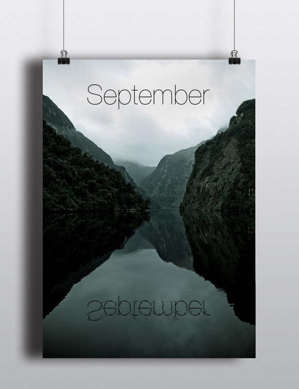 I interpret that Pozdnyak created this piece to be seen by many audiences on a day to day basis through the purpose of its creation, a calendar. The imagery within the pages produce a statement, a bold sinister mood is created through the tones in each image. The foggy presence where the image has been set and taken links to the month it is representing but also to the context of the piece. These images work more effectively in a calendar then they would in an exhibition due to their perfected placement in the calendar format also due to the concept and reasoning of the work, being placed in an exhibition may not establish the message clearly to the audience. Being seen by a wider audience through this style of expression Pozdnyak is able to ensure that her message will be seen. Due to the tones, mood and purpose of the calendar I believe it is clear to understand that the audience being targeted are an older range. The colour tones used would not attract younger viewers. Aiming to produce the message as a reminder of “The beauty of life” and that only time can be clearly seen though nature growing and changing, I believe that an older audience would be more suited which is why this designer has aimed her work for this age range. I find the simplicity within this work inspiring and perfect for the concept of the piece. The placement of the type works perfectly for it to be seen in each image. It has been carefully placed in order to be seen and I believe that they often represent various features linked to each month. I do believe that the sinister and almost haunting mood that the images produce was not an element focused to be produced the designer however I do think that it works perfectly with the work and mood. However this is only crucially relevant to the wintery months which work well. The spring and summer months contain a more brightened mood. The format of this work has been chosen perfectly for the purpose of the piece as well as being able to accompany elements within the work. I like how the designer has stayed clear of using simplistic and stereotypically images for various months such as a Christmas theme within December and using fireworks in November, I find the pure natural imagery indicates a clear context and forces her work to be drawn away from other calendars. I believe that if not all then most decisions have been considered in the creation of this work such as layout, imagery and text however I do believe that some of the summer images do not represent very summery tones. Using more brightened tones such as more oranges or yellows would have worked to a better advantage alongside linking to the concept and messages she is aiming to imply.
  I believe that the placement of the type is definitely an area that has been decided carefully because of the importance of the text and the tones being used. as this piece is a calendar and not just some images used to produce a message the names of each month on the pages are crucial. primarily this work is an object to be used by it’s audience alongside portraying a message created by the designer.
Overall I find this work distinctive and effective in it’s purpose and meaning.
