Lauren Mortimer: Illustrations

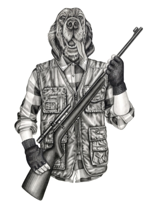
ImageLondon based illustrator Lauren Mortimer works “primarily in pencil” in order to create her interestingly realistic and conceptual styles of illustration. Her “ability for tone, texture and realism” Mortimer transforms the figures and characters within each drawing in order to communicate a specific message through each piece. Influencing her work, nature, surrealism and other designers are all expressed with an “air of curiosity and wonder” surrounding them. I absolutely love how Mortimers work contains a distinguished sense of irony within the concept. For instance the image to the left cleverly illustrates the figure of a human with a dog’s head in the style of a mug shot. I find this a brilliant way for the artists to express and illustrate how similar and equal animals should and can be seen. I find the grey tones add a sense of reality and seriousness to the scene being illustrated. Stating her pencil as her “primary best friend”, this illustrator aims to contrast “the innocent and idyllic world of childhood with reality” and this can be clearly seen through a lot of Imageher work. I like how she uses animals and humans as one in her work as a lot of her illustrations represent  messages relevant within the world today and uses a playful and interesting scene in order to depict them. I particularly love how she uses the illustration to the right to clearly illustrate a serious message behind hunting animals. She “creates charming drawings with a subtle darkness” and I find it brilliant! I love how this illustrator communicates serious messages and concepts within her work through beautifully crafted pencil drawings. Almost creating an evolving narrative within her work, Mortimer allows her work to be interpreted by the audience so that they can decide how they feel about the narrative being told. Increasingly important to her work, this designer aims for her audiences imagination to allow the work to take it’s own unique Imageview of the work and produce it’s own representation. Referencing vintage photographs in order to inspire her work, it is clear to understand how these styles of images have been used within this style of work. I like how this illustrator uses vintage styles within her drawings. I particularly like how serious and relevant meanings and concepts can be clearly seen and understood through her illustrative drawings. I like how this designer reworks her referencing images in order ot make them her own.
Communicating beautiful images to her audience and allowing them to create their own interpretation of them, I like how this artist works in this way. Refraining from using any other elements than pencil to create her work she prevents other media from overpower the actual image. Usually I wouldn’t like illustrators who work in this way however I find it works perfectly suited with the style of this artist. As an audience of her work myself, I believe that the colours and media used within this work is perfectly chosen in order to suit the style that this artist uses.

Overall I love how this artist works and I find her work greatly appealing. I like how she takes a simple concept and idea that would be overshadowed by the audience when simply being spoken about however Lauren Mortimer adds a sense of darkness to the message forcing her audience to be interested and emotional attracted to this. I like how this artist uses a dark sense to her work alongside keeping a large amount of reality within this.
Chris Ede: Limited Edition Prints

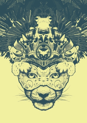
“Flourishing with an impressive array of prestigious clients from across the globe” this illustrative desiImagegner has created a range of pieces of work to aspire and appeal to a wider vary of audiences. Developing a “multitude of styles” Chris Ede over the past seven years has established a very highly appreciated design base. Tailoring his work for specific clients delving within Advertising, Editorial, Book and Music work, this designer specifies his work and creativeness in order to suit his brief given to him by his client. “Clear and precise” objectives and ideas are developed into truly magnificent pieces by this designer. By “Maintaining his objective” Chris Ede uses a “speedy” technique when producing these styles of prints. “Thinking outside of the box” Chris Ede “avoids clichés” when creating his imaginative representations in order to appeal to his given brief, clientèle and audience. Being known to create beautiful illustrations that give the illusion that they “leap off the page”, this designer gives his work an identity through his unique style and process. Linking to my concept and theme of work, this set of prints created by Ede appealed to me greatly as they contain an intense amount of reality and details yet have been used in a contemporary, graphic style. “A print and ink kind of guy” I find this designers style very graphic! This style of work in particular gained my attention as I liked the simple colour tones that he used alongside being intrigued into how this style of work could be used in a design industry. Communicating a great deal of simplicity through his prints, freelancing his work Chris Ede also enjoys working with other artists and designers in order to create “exciting work”. Evolving from initially training as a Fine Artist, this designer finds inspiration through other illustration work. Focusing on his Limited Edition prints, I find them graphically beautiful and interesting to look at. Delving within lettering, black and white tones and lines Chris Ede works mainly with Pencil, Watercolour and Inks in order to create his eye catching work. Ede works within a range of Imagethemes from fantasy to nature and people. Looking at a wider range of his work I find some of his illustrations really intriguing, like his animal prints that I have chosen to look into, however other styles of his work do not appeal to me as much as these.  I like how Ede uses mainly imagery to communicate with his audience however type does become relevant in some of his designs. He uses simple lines and detail in order to produce a style and mood to them talk to the audience from this. I personally find his black and white illustrations more appealing than those which have been embedded with colour. His work almost looks as though it contains a certain patterned style, similar to the work create by Iain MacArthur. I have found many similarities between the two illustrators, such as, the colour tones used, the use of animals within their work and the materials they choose to work within. One criticism I do find within Ede’s selection of Limited Edition Prints is that I find them too similar to the work of other illustrators. I thoroughly admire the skill and style that this designer uses however I believe that he would push his work to becoming more of his own. A major element of these prints that I find highly appealing is the graphic edge they have been given whilst capturing a great deal of reality within. It is easy for the audience to understand what animals are being illustrated and portrayed within the prints because of the features and realistic representations. However, rather than simply using these prints as a way to directly duplicate the image of an animal, Ede produces a more sophisticated, sensual style and image of the animal, a technique I find truly admiring. 

In order to communicate with his audience, I believe that Ede successfully takes his brief, or concept and plays with this so that he can deduce what style would best suit the intended audience and meaning that is being illustrated through the work. I believe that in a lot of his work Ede allows the illustrations to speak and communicate with the audience without the assistance of typography, I admire this however find it a struggle to understand fully what his aim is without interpreting the work myself and almost guessing the message he wants to portray. Like many artists who simply create work to allow the audience to create a story behind it, I believe Ede’s work is mainly for an advertising style of purpose where the interpretation of the audience is not a key element. 

Currently inspired by the work of artist Matthew Woodson, Chris Ede’s style originated from cartoon and comic styles of inspiration. I overall like this set of Ede’s work, despite not being in love with his illustrations I find they can be used in an array of interesting and appealing ways in order to attract and communicate with their intended audience. 

Iglika Kodjakova: Animal Typography

ImageClearly aimed at a younger audience age range, this typography style has been created by designer Iglika Kodjakova. Illustrating numbers and text, this designer has created an animalistic type which uses a range of soft pastel colours in the style of animals yet in the shape of numbers. Personally I like this set of illustrated type despite not being the specific age range that it communicated too. The simple, bold and relative colours allow the audience to understand what colours are represented with a specific animal.For instance, Z in this set of illustrations represents a zebra and this can be identified through the drawings and the colours/patterns used. I like how this set of designs educates the audience. When learning the alphabet as a child the letters where linked to a specific object, for instance an apple was used to represent A. I like how this alphabet has an animal theme as it will appeal to both genders and a range of cultures. By using fun and simple designs for the letters, the designer has ensured that they are easily understood by the young audience. One criticism I do have with these designs is that the type is similar to many that have been used and created before such as “BAUHAUS 93”. However, despite this the simple curves of the type and the way that the designer has prevented any features of the animal to take away from the shape of the letter has served as a huge benefit to the communication between letter and audience. The link between letter and animal alongside animal and colour has proved a crucial success to the overall set of letters. I overall like how the set works as a whole and how easily the letters can be identified by a specific animal. Usually, I refrain from liking any child based work however this works perfectly to suit the purpose and appeal to the audience. Refraining from using bright and overpowering colours, this designer has perfectly chosen neutral tones and shades in order to create her illustrations. This element of her work has been perfectly chosen in order to appeal to such a young audience. When looking at these illustrations you can imagine them within children’s books, as posters in classrooms or even as objects within a child’s room or nursery. This highlights how successful these designs are in reference to communicating with the audience. 

In order to suit the purpose, Kodjakova has chosen to use very simple designs, choosing not to add intense detail in order to overpower the shape of the letter allows an equal balance between letter and animal. The only criticism I have when viewing this style of work is the letter “S”. I don’t think this letter design is as successful as the rest as it only shows half of the basic letter s. As this alphabet is aimed to educate children it is crucial to use appropriate and correct shapes for the letters and personally, I believe that this letter does not produce a successful communication with the audience as the others in the set. 

Other than educating the audience, these illustrations look nice. The appeal to a younger audiences attention as the colours are contrasted with one another. From choosing the animal to suit the letter to the delicate decision on colours, every element of creation has been perfectly chosen in order to fulfil the purpose of the creation and to communicate with the intended audience. “Super fun” designs are successful when educating the audience. As these illustrations would have been used to educate a young audience, such as primary children, to learn the alphabet they need to be able to keep them entertained and by producing these styles of letters Kodjakova has done so brilliantly. Communicating with their audience perfectly, this designer has understood what style her designs had to be like in order to keep the audience attracted. Throughout a lot of this designers work these children aspired illustrations have become more and more popular and this set of alphabetical type designs perfectly suits Kidjakova’s style.

Harpers Bazaar – “Wild Thing” Editorial

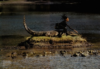
ImageShot by French photographer Jean Paul Goude, this editorial piece centres famous model Naomi Campbell for Harpers Bazaar racing against an array of wild animals. One of the world’s most known fashion magazines, Harper’s Bazaar, this editorial has been recognised as one of their most inspired yet. Looking “amazing” the model is used to duplicate the actions and appearance of the animals being seen within. For example it is clear to see how she is running alongside a cheetah in a similar print of clothing as the fur of the animal. I like how the human is representing the animal in a turn of events as the animal is usually second to the human. Obviously this shoot would be a prime example of how animals are cruelly used by humans for the entertainment of others however, I believe that this shoot can clearly show the animal and human as equal. I really like this shoot as it illustrates the animal in it’s own habitat. The strength and  power created through this set of editorial work is a way for animals and humans to be empowered. Communicating with an older more female based audience due to the purpose of the shoot being created, for a fashion magazine, it is clear to see how this set of images would appeal to the audience as it expresses deep beauty of model, animal and landscape. Clearly not created for a younger audience, this editorial has gained a mixed response from audiences as it has been named as being “Tired, played out and not progressive”. I understand where this response has evolved from, this style of shoot has been done before however it has not been Imagecreated to show how Africa has “progressed” it has been created in order to communicate the strength of the model and to appeal clothing to them. Looking at the pictures from this shoot I only find the cheetah photograph appealing. I find the crocodile image very unappealing and fail to understand why this has been used. The cheetah image shows the model and animal as equals and expresses great comparisons between the two, and overall presents a scene that the audience would like to see. However, other images from this set simply fail to appeal to me. Criticized for not including more “creative concepts”, I agree with the realisation that this editorial is simply becoming a little boring the more you see it being done. Despite expressing “power and domination” and showing the strength of women, it is a very typical way for the magazine and designers to express this, for instance if you wish to express speed, use a cheetah, it’s the fastest animal and that is exactly what this editorial does, use the most common forms of power and strength. 

In regards to the actual photographs being used I find the images well captured. The scenes suit the mood and emotion that is being created. For instance aiming to express the empowerment and dominance of women through the crocodile photograph the scene around the central model and animal is extremely darkened allowing most of the light to highlight the model in the centre. I really like how the lighting and shading has been used in order to express the mood. Researching reviews of this shoot many comments include describing the shoot as being “insulting” and criticise the choice of model as many agree it would have been more relevant to use an African model with an interesting background story of the country to promote a more inspiring concept. I believe that creating a more relevant concept the the place being pictured would have been a more successful choice however I disagree with he comment of this piece being “insulting”.

Overall I like how the model and animal are equal within the Cheetah image however as a whole fail to understand the reasoning behind why the shoot has been created as it does not advertise a set of clothes or have a connection to the model being used. I do love the style of images and the elements that have been captured however it is obvious that this piece has communicated a mixed message with the intended audience and caused a great deal of confusion and controversy. 

Elle Norway Magazine May 2011 – “Peace and Love”

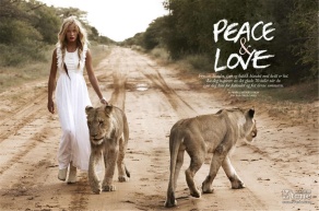
Focused within the “great outdoors” this magazine shoot and cover, shot by Asa Tallgard andImage including a range of exotic, African wild animals expresses a concept of “peace and love”. As this magazine is a fashion and celebrity based media I understand that the name of the shoot would refer to the style of fashion that the models are wearing however, I also believe it can be interpreted to illustrate how humans and mammals could live together in peace, no hunting. I like how the images can speak for themselves and show the animals and model in the animals natural habitat. The simplistic and minimalistic type included uses the perfect typeface for the style and mood being created through the photography. Many people within the audience would argue against this style of work as they would believe that the animals are being treated unfairly by being used as object within the shoot. Although this would be a valid argument the style of work can also be used for the animals point of view to show that animals and humans are more equal. I like this style of shoot however I like it more for the animals within rather than the advertising of the clothes or model, to be honest I dislike the clothes being shown. The designer has clearly chosen many of the features of this piece to work as a team and produce the most appealing and attractive style of layout. For instance the type has been cleverly placed so that the white colour can be clearly seen and understood by the audience. Talking a “walk on the wild side” is a large understatement for this shoot. This “safari inspired editorial piece” manipulates the audience into wanting to walk with animals, this would be a great way to highlight how alike Imagehumans and animals are. Also this shoot communicates with the audience to illustrate and remind them of the beauty that animals consume, informing them of what we are losing within the world. Personally I love the safari look and tones creates from the sun being present however the black and white toned photography also works perfectly well. It adds a realistic and sophisticated image to the wild nature of the scene being photographed. This photographer has been used endlessly by famous fashion magazine companies and her work for this shoot is undeniably successful! Using animals a lot within her work, this shoot has been one of the only ones that she has used unusual picks of animals. Usually choosing to photograph horses and dogs etc, this shoot stand out against others to communicate with the audience because of the animals it includes. Seen as “fabulous” this editorial piece has gained excessive amount of feedback. Aiming at a more feminine audience because of the purpose, to advertise clothes, it is obvious that this style of work aims at an older audience through the reality in the images and the garments they are advertising. 

Strangely, this piece of work produces the animals in a “sexy” light through the scene and posture they are given. The patterns of the animals are highlighted greatly and there movements ass to the mood of the scene. Pulsating “drama, attitude and intimacy” the lions within this shoot add to the style of mood that is being communicated with the audience. By creating a “sensual” atmosphere it allows the audience to want to be the model within the pieceImage manipulating them to want to go out and buy the clothes being advertised, ensuring that this editorial piece is a huge success for its purpose. “Captivating” the audience with the use of power shown through the Lions, this piece expresses strength and style through the female figure. Overall I love this set of images used within the whole editorial piece. As an audience to this set, I immediately am drawn to the beauty of the images and want to look like the model within. I also almost want to go out and book an African Safari holiday immediately as the beauty of the landscape used and the animals included draw the audience in though their intense beauty. All elements of this piece have been perfectly selected and shot, from the time the images were taken, to the posture and placement of the animals and model. 

Alex Broeckel: Chocolate Bunny

“Computer Generated Images” (CGI) designer Alex Broackel has created a range of digitally edited Imageillustrations including his iconic “Chocolate Rabbit” advertisement. Ironically showing a chocolate rabbit with a bite out of him, this illustration is a humorous representations which captures the audiences attention. Humour is key when communicating with the audiences in this illustration as Broeckel is playing on the idea of people eating chocolate bunnies at Easter and creating the illusion that the bunnies are in fact real people, ironically presenting the image that the human person eating the bunny is an animal, the lion in the food chain. I find this piece highly appealing and attracting as the idea behind the work has a humorous side to it. Also I find the darkened background creates a tense, horror styled atmosphere to the piece as if the killing/eating of the chocolate bunny had been prepared and set up, in a series killer/murderous style of way. Broeckel has finalised all elements within this piece, the background, foreground, facial expression of the bunny, the evidential remaining chocolate laying beside the character to even the crumpled wrapping. I like how the wrapping contrasts against the other colours used in the piece. As it has a gold texture it also creates the idea of high end clothing, as if this bunny was expensive. A major feature of this piece that I like is the expression of the bunny, the designer has successfully created this so that the audience feel sympathy yet humour at the characters expense. The shocked expression is an obvious choice considering the scene it is being used within however the eyes are key as they have even been created to stare straight into the audiences direction, eyesight.

Described as being “superb” and “deliciously cool” I agree that this piece of work is simple yet effective when attracting and communicating with it’s audience. However, I fail to understand why this piece has been created apart from a way to make the audience laugh. With no type or information in regards to a brand it may be created for this piece is simply an illustration 47694c3a18e9e872555f44d54b382a6acreated by the designer for the audiences attraction. I believe that this would be a great style of advertisement for a healthy eating style of campaign aiming to sympathetically draw people away from eating chocolate bunnies, or if used in a different context it could be used by chocolate companies to attract audiences. In order to turn his style of work into an advertisement I believe a simple line of text perhaps and the bottom of the image in a golden tone would suffice perfectly.

Closing into the facial expression of the character used within this piece every aspect and feature of the face has been realistically kept in order to assure the audience of what animal it is however the facial expression is extremely human. For instance it would not be everyday that you would see an actual bunny with this expression on it’s face. I believe that Broeckel has used this expression to communicate with the audience because they would relate to the bunny in a sense that this would be an expression they would use if they were chocked. Obviously they wouldn’t relate to being made out of chocolate and being half eaten but the message the designer is portraying would be relate able. Another feature that this designer has successfully perfected is the lighting within the image. The lighting adds a suspension to the emotions being created within. The highlights of the  features of the face allow the audience to understand  how the character is feeling. Alongside this the way that the designer has ensured that the gaping hole within the back of the rabbit is highlighted so that the inside is dramatically darkened adds to the humour. The lighting and shading works perfectly and realistically tot he scene.

Undeniably I really like this piece and style of humour that is used as it gets a message across using a humorous event that would be known and relevant to a large audience. Chocolate Bunnies are famous around the Easter period so would be recognisable by many which is why I believe Broeckel used this for his piece. Overall I find this illustration and style extremely effective! Broeckel’s clever use of humorous and sincerity produces a successful piece which communicates well with the audience because the amount of humour that is included.

Walt Disney: Mickey Mouse Character

ImageKnown as Walt Disney’s most famous, loveable character, “Mickey Mouse” was not Disney’s original loveable icon. However the 1928 creation has become one of the world’s most cherished creation in regards to animal inspired characters. Loved by all ages, this character was created in order to appeal to the audience and represent Disney’s entire image. Communicating a fun and adventurous/friendly personality, this character has been used in a range of roles. His appearance produces a loving, affectionate appeal that audience would clearly be attracted too! Especially appealing to children, this character design uses simple yet effective colours to attract the audience attention, as his body uses black tones and his attire consists of contrasting yellow and red styles his appearance comes across as subtly bright. The yellow and red contrast against one another and with the assistance of the black his final appearance is a success. As this character mainly appeals to children and a younger audience because of his purpose of creation, I believe he also appeals to a range of adults. Primarily because they have grown up knowing and loving this character, it is also a way for them to get back in touch with their childish side. I believe that this character appeals to a vary of audiences.  Loved by audiences for over 80 years, Walt Disney’s most famous character has been created with a very “cheerful” face due to the large grin and affectionate features. I believe that this character communicates a positive relationship with his audience because of the facial features and expressions he is given. Evolving over the many years he has been admired by audiences, the character of Mickey Mouse has been “re-drawn” and edited by a range of ani

mators in order to continue appealing to his ever changing audience. However, some styles of this loveable character have not gained a great deal of success. More modernised, digital versions have simply ruined the image of the character as designer have continually referred back to the original character. The “anime styled creation” to the right simply shows a disgraceful evolution of this loveable character. As an audience to this design I have to admit I hate it! It ruins the loveable, friendly appearance originally create by Walt Disney and it is acceptable to understand why this style gained less positive feedback from he original design. Gaining great responses from his audience, this character cleverly makes his audience laugh. “When people laugh at Mickey Mouse, it’s because he’s so human; and that is the secret of his popularity. I only hope that we don’t lose sight of one thing — that it was all started by a mouse.” spoken by Walt Disney himself it is clear to understand what his intentions were when creating this character. To appeal to the audience. Purposely created for the audiences appeal, I love this characters design, he moves like a human, he talks like a human and he acts like a human. I love how Walt Disney has created a character from an animal that many would not love. Creating this character as a bear or a kitten would of been an obvious approach as they are already loved by the audience but Disney did the opposite, he took an animal not like by many but soon captured the hearts of millions. Mickey takes the stereotypical traits from a young boy and gives them to Mickey as he “chooses fun over work” and when with the other famous characters creates by this animator and his team he such as “Donald Duck” and “Goofy” he is part of a family not just a team. Personally I adore this set of characters and find the simplicity behind his design and creation key. 

Given numerous traits, this character appeals to a range of audiences. For instance he is seen as “a father figure to Pluto” which would appeal to young children, and accounts him as “his best pal” the same way young boys see their family pet. He is “dumbstruck” when in sight of Minnie Mouse, a trait many males would appeal to! It’s obvious that this character has been given a human personality which is a way that Disney know they can appeal to their audience. Taking an animal and giving them human personalities and traits has been a success within a range of films in order to attract audiences and communicate with children. I find this character a true success and Disney’s attractive and memorable design has been crucial to this characters success. 

Daniel Mackie: Animal Illustrations

First finding Daniel Mackie’s illustrations I immediately had mixed emotions when looking deeper Imageinto his work. The originality to use a narrative behind the animal’s that he is illustrating and manipulating this into their physical decorative figure intrigued me greatly. However, as an audience to these pieces of work most simply did not appeal to me at all. Mackie’s “beautiful” watercolours creations have gained an intensely positive audience range as his work can be found within many media such as postcards, books and basic illustrations. Personally I do not find a lot of Mackie’s work appealing they show a very unrealistic view of the animals in their true form. I do like how he uses the narrative within physical appearance as it creates the illusion that the narrative is part of the animal. Abandoning Photoshop for more traditional materials such as watercolour and pencil, Mackie prefers to use hand drawn designs as he found digital media constantly a struggle. I admire how this artist keeps to his own traditions and uses only hand drawn designs as I believe it expresses more skill than the digital era that art has been overshadowed by. Inspired by Japanese prints, Daniel Mackie’s illustrations can clearly be recognised with a specific Japanese style through the colours and pattern styles that he uses. Using a blend of “stylised imagery” and decorative patterns, I find Mackie’s illustrations aim more toward a feminine audience I believe as they are created with  beautiful colours and contain narratives within. These styles of illustrations would appeal to both children and adults I believe as children would enjoy looking at the patterns and colours that they consume as adults would find the narrative interesting to understand and admire. Mackie’s design process includes “a lot of thumb sketches” (small quick drawings in a size no bigger than Imagea thumb nail), a range of ideas and drafts that get sent between the artist himself and the client, leaving a large amount of time between various areas of the process so that he can keep a clear head Mackie uses the same process for every client in order to keep his artistic success going. This award winning illustrator creates his interesting designs of animals as “visual solutions to countless briefs”. Within each of his illustrations Mackie uses a narrative styled moral for instance within his “Badger” drawings he uses a “good badger/bad badger” style of approach, like good cop bad cop. Many of these narrative stories arose from the early nineteenth centuries and Mackie aims to illustrate these tales so that they can evolve into the modern era. Using Greek Goddess’, Fairytale’s, historic icons and events and  art deco styles of design, Daniel Mackie clearly communicates traditional mythology with modern designs and using traditional methods. I find these illustrations interesting in reference to their underlining messages and concepts however when viewing his drawings as part of his audience I find them less attractive than others. I admire illustrations for their skill and realism to them and I prefer black and grey tones however the overwhelming amounts of colour in Mackie’s work I believe is simply too much for the audience to undertake. I do understand how these styles of illustrations could be used and would gain a large appeal from the audience, however to me I simply do not find them as appealing as others. 

Inspiring his work, Mackie accounts anything from “other peoples’ work to nature” as he loves the “magic moment” when an idea or concept works on paper. Putting himself out of his comfort Imagezone has been an “inspirational” and successful project for Mackie to overcome. Transforming from a digital Photoshop user to a more traditional styled artist has seen this designer gain great success within these animal illustrations  that have been created after his media change. 

“What Will it Take Before we Respect the Planet” – Collaboration of Artists

ImageCreated by a large collaboration of graphic designers, illustrators, a typographer and photographer, this set of images used within the very effective WWF campaign beings a range of artistic areas together to create one very well crafted piece. Involving designers were Mathieu Javelle, Stephane Bales, Sid Tomkins and Raphael Van Butsele who worked alongside Artistic Director, Emmanuel Bougneres. This 

collection of advertisements which delves within world wide topic of biodeversity and the bioawareness immediately spoke to me as it instantly caught my attention due to the realism of the subject and image that works alongside it. I understood the message behind this advertisement clearly and I like how the designers have used a great amount of realism within the piece. By doing so they have been able to communicate the seriousness of the problem that occurs within the world today alongside promoting their message through an interesting way. When viewing this set of poster advertisements I immediately thought “I wish I had thought of that” immediately becoming inspired by the way they have illustrated their concept. I also like how they have worked together using a range of design media and did so in a natural kind of way. When looking at the image you cannot define where one designer has

Image

 worked, stopped and the other has stepped in, it all fits perfectly. A brilliantly professional set of work, I love how scenes appear so natural yet promote a serious, unnatural message. Communicating  a natural species with the “artwork” that is found sprawled across the country, Graffiti. It’s no surprise that the designers have used less viscous animals such as elephants rather than Tigers however I would like to see more adaptations of this kind of style, using more animals. On the other hand I also like how the background can represent the habitat of the animals however can be identified as the style of abandoned car parks and estates found within the UK, where this style of Graffiti is often found. I believe that these advertisements clearly communicate with an older audience and I like that. Using only a small amount of typography and not in a usual “added on top of an image digitally”kind of way I find its a great communicative element that differs from others styles of advertisements. I understand that a lot of people may have a negative approach to this set of images as they may find it rather cruel to put graffiti on an animal however it is also a way for the designers to communicate the message to not harm animals the way graffiti is used to harm out society and image. 

The colour tones used within these images are perfect for the mood being communicated. The dull tones represent a worn out, uncared for effect which has been superficially used by the designers in order to enhance the idea that the animal kingdom and the earth is not being taken care of the way it should be. This, overall is a perfected piece using a range of materials and elements. As a viewer of this work I understand the concept clearly which illustrates a clear communication between artists and their audience. This set of images can clearly attract a wider audience as it appeals to both genders and a range of ages, except children obviously. 

The very simplistic and almost unrecognisable text in the bottom right hand corner of the pieces contain a very simplistic sentence, message. I find this just finishes the advertisement as the size and placement communicates the message alongside being understood through the words. By using a simple typeface, colour and understated style the designers are able to express the reality that there messages are being overshadowed by other situations and issues throughout the population.

Overall I love this set of advertisements I admire how real the designers are and I find the message is clearly communicated with the audience.

YOAZ: Graphic Animal Illustrations

ImageSeen as an “amazing” illustrator, Yoaz has taken a “very different approach” when illustrating animals as a graphic element has been intertwined through the shapes, colours and illustrative nature of the work. Each piece of work has an elaborate amount of detail which singles this illustrator out from others around. I find some of these animals have been given an extremely mechanical illusion through the amount of detail within the design. I find this different style is interesting however I think I admire the colours being used but the mechanically graphic style of pattern is not one I would immediately like. At first glance of a lot of the work within this selection I do like them and find them appealing however I do believe that in some of the illustrations the of the animals are overpowers by the graphics and this often takes away the nature of the animal, an element in some of the drawings I don’t enjoy. The first image I have used is one I find extremely appealing however others such as the Gorilla and Elephant illustrations I simply find ugly. A lot of this illustrators work produces an extremely masculine style from the colour tones and harsh lines being included. However, I do believe that the illustrator has used colours which links to the animal as well as the mood that they are aiming to interpret to the audience. For example the Tiger illustration uses orange and black tones which obviously link to the pattern of the tigers real anatomy. This element I find really appealing that the illustrator has blended the reality of the animal with the graphic style. Using a large amount of geometric shapes and lines within the illustrations, the designer creates “electric circuit” style designs. Within communicating with the audience these style of illustrations ImageI find would appeal more to a masculine, adult audience, moving away from a childish audience I struggle to see where these styles would be used within the design industry.

Working clearly within digital art the intent of this illustrator is “to create a powerful image”, an intention that is clearly successful. The harsh shapes and patterns used produces an overpowering image showing the animals as string almost robot like creates as if this designer is recreating the animal kingdom to suit this evolving technical reality that we all live within. Giving an image an abstract touch to it, Yoaz prefers to construct his images rather than draw them from scratch. Excessively heightening the use of detail within each individual drawing, I find this work appealing to look at however I do not fall in love with the illustrations. Inspired by the likes of Gustav Klimt it is clear to understand and see that style of work blends within this style.